“How lovely yellow is! It stands for the sun.” Vincent Van Gogh
Today I want to dive into a lesson all about colour. I have already done articles on the colours purple and blue and one exploring many different colours.
I love to photograph colour, and am always ready to let colour take centre stage in my images.
Because, and I repeat these quotes a lot, because I couldn’t say it better:
“Color is joy. One does not think joy. One is carried by it.” Photographer, Ernst Haas
&
“I found I could say things with color and shapes that I couldn’t say any other way – things I had no words for.” Painter, Georgia O’Keeffe.
Even if colour doesn’t capture your imagination in the same way it does for me – because we live in a world awash with colour, you need to be able to work with the impact that it creates, and the power that it has, so that you can master using it in your compositions.
Just a splash of yellow in this photo – but doesn’t it make a huge impact?
You don’t want your photos to be hijacked by unintentional forces – and this is what colour that you haven’t fully considered, can do to your photos.
A splash of red can distract the eye, a dark grey sky can create a feeling of foreboding on a joyful subject and just the merest hint of green could create imbalance in an image.
We want to be intentional about everything we are placing in the frame, therefore developing an awareness of colour is vital, so that we can be in control of our compositions.
I like to think sometimes that we are just working with shapes and forms in different colours. It can make thinking about composition much easier.
Even though Claude Monet is talking about painting here, this totally applies to photography:
“Try to forget what objects you have before you – a tree, a house, a field, or whatever. Merely think, ‘Here is a little square of blue, here an oblong of pink, here a streak of yellow,’ and paint it just as it looks to you, the exact color and shape, until it gives you your own impression of the scene before you”.
We create the photos. We place all the elements that we want in the frame.
Everything is intentional, and colour is really good to focus on because it’s one of the easiest compositional tools to become aware of and start working with.
Today I want to explore a colour that is often associated with the feeling of joy, happiness, brightness, positivity. And that colour is of course YELLOW.
Now like everything in our universe, where there is light there is also dark. The ying and the yang.
Yellow can also invoke feelings of decay, cowardice, fear, sickness and jealousy.
But why do I talk about the feeling of colours?
Because firstly – photography is all about feeling. Most photos don’t ignite any feeling because most of the photos we take are not good photos.
All excellent photos are made excellent because they create a feeling within the viewer.
It could be any feeling – awe, joy, love, fear, apprehension, melancholy, desire etc.
And this is because it doesn’t matter how great the photo is, your viewer will never remember it or take pleasure or interest in it if it feels meaningless, devoid of feeling.
“Photography for me is not looking, it’s feeling. If you can’t feel what you’re looking at, then you’re never going to get others to feel anything when they look at your pictures.” Don McCullin
I always like to ask myself:
How do colours make me feel?
How do they affect the scene and my subject?
Yellow is a warm colour and sits next to orange and red on the colour wheel.
It stimulates the nervous system and energises us (and painter Kandisky said that if colour were a sound it would be a joyous one) but if overused it can feel nauseating, tiring and be a strain on the eyes (rooms painted yellow are quite rare because of this fact.)
So let’s dive in and explore the different ways you can use yellow to create different feelings and messages in your photos.
Bright yellow is very powerful, and grabs your attention, even the merest hint of it. It is bold, joyous, positive and uplifting.
Bright yellow is used to attract attention. For example the combination of black writing on yellow is one of the easiest colour combinations for the eye to see on things like buses and signs.
It is also the colour of warning and danger. This is because it is the first colour that is seen with our eyes and that is why it is used as a warning all over the world.
What does this yellow say to you? What about the combination of bright colours?
These splashes of yellow are so strong and vibrant, right? Bright yellow is such a dominating colour that you only need a few suggestions of it for it to really create a powerful feeling in your photos.
For example, this photo below is very busy – but look how how striking the yellow elements are:
How about the yellow in this photo I shot in Morocco – how does it interact with the other colours?
To me the line of yellow is so bright and happy it connects with the smiling boys, and contrasts with the more sombre face of the woman.
Look at the photo below. Even though this is also a bright yellow, how do the textures of the street affect how you think about the colour?
Now to Istanbul and its famous tulips. To me this bright yellow is a burst of joy against the dull light and the grey wall. It says to me, the beauty of nature is amazing, even on the greyest, saddest of days:
Now, how about this – yellow is playing a big role in the photo – as a contrast to all the blue – and blue and yellow are complementary colours (opposites). Doesn’t the yellow here feel a little melancholy?
Let’s jump over to Cuba now. I love to place people against bold, simple and colourful backgrounds. Especially when you can contrast the colour of the outfit with the wall:
The yellow in the photo above is not as bright, and to me not a joyful feeling at all. What does it make you think of?
This photo below is one of my favourite images, and it takes on that more melancholic- decay feeling that yellow can imbue that I mentioned earlier.
Do you think it’s the fact that it is tape on the street or the shade of yellow that creates that feeling – or maybe both?
Now to the glorious glow of sunlight on the sea below. It’s so rich and golden. It has such a different feeling to the bright yellow, no?
To me this golden yellow feels so opulent. It’s like summer in one colour. You can feel the radiance of the sun, its heat and almost feel this rich light on your skin.
Now, how about the yellow glow of this street light, a totally different feeling, right? You can feel the atmosphere it creates in the early morning.
So that finished up my mini-study about the colour yellow.
Did this help you think about the role colour plays in your compositions? I would love to know – please share your thoughts in the comments below.
Today I am still driving around the fairy-world-like landscapes of Ha Giang, it’s a breathtaking experience.
I am unashamedly a colourphotographer. I have always loved colour in my photography, even when I was at photography school, emerging as an artist and black and white dominated the art scene.
I stuck to what I was most passionate about – and that was a life in full colour.
My own journey with colour has been one of experimentation, fun and pushing the boundaries.
I spent many years developing a solarisation process for my film colour photos, leading to the kinds of surreal photos that you might imagine coming from dreams:
I have also relished capturing the pure colours of nature:
And also the hyper-real colours that come from HDR photography:
And of course the fun colours that humans bring to the world:
As well as the results of colour work in processing:
The point for me with colour is to enjoy the process and go where my imagination takes me.
Because imagination is such an important part of photography for me.
Imagination helps you see beyond your immediate environment, and creates something that weaves in your ideas, your experiences and your passions.
“When I’m ready to make a photograph… I quite obviously see in my mind’s eye something that is not literally there… I’m interested in something which is built up from within, rather than just extracted from without.” Ansel Adams
Today I want to share with you some ideas that I teach about colour – and how they can be used to evoke emotion in your photographs.
I also have a photo challenge that I am setting for you at the end of this post – because I know so many of you love to experiment with these ideas.
And I have a free eBook for you too – that brings many of these ideas together into a nice and simple explanation.
I’ve talked a lot in the past about my love of light. Light to me is mesmerising. I want to feel it, to capture it, to show it in all its glory.
But colour to me is an equally beautiful thing, and totally connected to, and affected by, light. And because:
“Colour is joy. One does not think joy. One is carried by it.” Ernst Haas
I love that thought – carried by colour and joy! Haas for me is king of capturing the feeling of colour and light.
“I paint because colour is a significant language to me.” Georgia O’Keeffe.
I want to celebrate some of the sheer vibrancy that colour brings to our lives and how we capture that as photographers, as artists, as people who are paying attention to this wild and beautiful world.
I want this to inspire you to look at how you capture colour in your photos too.
Colour is deeply affecting to us as humans. Think of all those colour charts – red signals danger, blue signals cold etc.
For me colour is a way to bring emotion into your photographsin a very simple, powerful way.
The artist Wassily Kandinsky developed a colour theory that stated that colours made people feel certain ways.
“Colour is a power which directly influences the soul.” Wassily Kandinsky
Let’s look at some colours – and the emotions they induce.
Yellow
Warm, exciting, happy
In the photo above look at the contrast between the red and the yellow. What does the yellow bring to the photo?
I would say this is a happy yellow – would you agree?
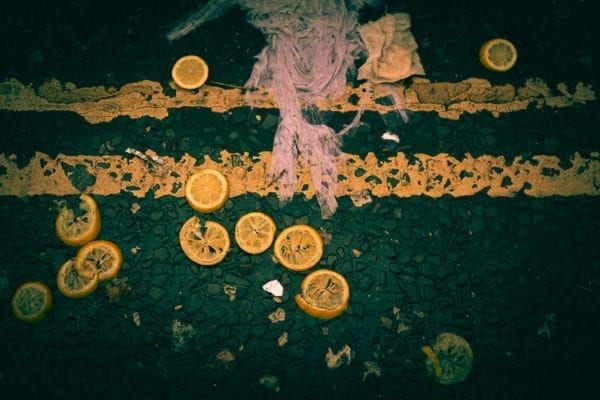
A more muted yellow – how do the textures of the lemons and the lines affect how you think about the colour?
Blue
Deep, peaceful, supernatural
I find the blue in the photo above very soothing; what do you say?
A much bolder blue – does it feel cold to you? Striking? Deep?
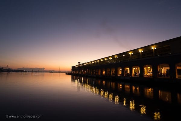
Another light blue with very soothing peaceful qualities. Also expansive?
Here is a lovely little film animating Kandinsky’s colour theory. Plus an article about the artist that brings in the sound and musical elements of his work, as well as the feeling of colour.
Now do you agree with Kandinksy’s ideas about colour? Do they evoke those emotions within you?
The key for me in creating emotion by using colour is to capture the essence of that colour.
For example – the happiness of yellow, the peacefulness of blue, the boldness of red. You can use the characteristics of the colours and find objects that encapsulate these characteristics, or the essence of that colour.
We want to feel the innate qualities of the colour, we want to have a deep emotional response to that colour in the photo.
So it isn’t a matter of just going around and looking at colours and snapping away at them. It’s finding colours that provoke an emotion within you, and working to capture that feeling.
Let’s look at some more photos and see…
It doesn’t have to be vibrant colours. The depth and subtle variations of any colour is a mesmerising world of its own.
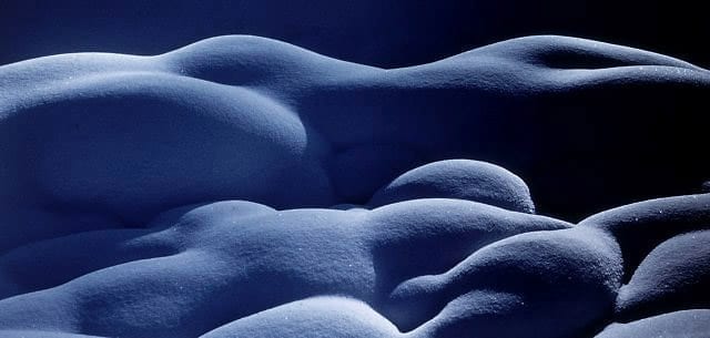
In this photo above can you feel the coldness of the white frost and the earthiness of brown? This to me is capturing the essence of a colour.
In the photo below I love to bring out the richness of the more muted subtle colours. Which I have to really be good at as winters are long in London, lol!
The feeling of the photo is made by these muted colours.
Capturing colour as the main subject of your photo is often easiest to start doing when you break down the elements, photographing parts of the subject and turning it into an abstraction:
“Everything that you can see in the world around you presents itself to your eyes only as an arrangement of patches of different colours.” John Ruskin
I would love to know – how does colour affect you and your photography? Let me know by commenting below.
Photo challenge
It’s time for a photo challenge! I would love to see your photos of colour in your photography. Post them in my photo sharing group Light Monkeys on Facebook or email them to me.
Free Colour as Emotion Photo eBook
I have a free 31 page eBook, if you’d like to get a free copy of this, email us on info@anthonyepes.com.
But today we want to give you just the essential meaning of how you can use Leading Lines in your photos. This is a potted guide!
Leading Lines can:
Take your eye on a journey – either through the photo or out of it completely (and with roads and paths, often to infinity)
Direct your eye to the main subject of the photo
Direct your eye in a specific order through various elements of a photo
Create depth in a photo – and this is a really fun idea to play with
Now – what do different lines evoke in an image? Some ideas:
Diagonal lines – bring energy and movement
Diagonal lies are excellent at bringing dynamic energy and a sense of movement to your images.
In this photo below these neatly stacked diagonals are bringing your eye quickly into the photo, leading you into the distance.
Horizontal lines – bring calm
For a sense of calm and peace. Our eyes seem to find this direction the most reassuring. This one is obvious:
But how about this one? Horizontal lines still, but a very different subject – urban, a bit grimy and messy. Still calming? I would say yes. I think the eye likes a bit of order.
Curvy lines – are pleasing to the eye
Curvy lines can create a dynamic look and convey energy. In the photo below I think the curved lines are more subtly leading the eye through the photo.
I love the strength the lines convey next to the luxuriously light and ethereal sky.
Another curvy line, this time, a road!
Look up!
Vertical lines – portray strength and power
Vertical lines convey strong feelings of stability and strength both in the man made world:
And in nature (at one of the world’s greatest forests in my opinion, The Lady Bird Johnson trail in the Redwood National Park in my home state of California) :
Or how about a bit of both – horizon and vertical? This was shot at La Defense in Paris. If you love playing with reflections and the hard lines of new buildings it’s an awesome place to shoot.
Implied lines – can also be powerful
Some lines are just implied– but they can still be impactful. See in the photo above how the line of people creates the impact, the story of the photo?
That’s it folks! My 2 minute guide to leading lines. Hope it helps you!
Happy photographing,
Anthony and Diana
Take better photos by breaking the world down into elements
Today I want to give you a super-simple idea that, if you can grasp it, and then put it into practise, I guarantee will really help your photography.
What we are basically doing as photographers is looking at the world, identifying interesting subjects and organising them accordingly. The way I like to approach this is to break the world down into elements.
If you think about the traditional rules of composition – what they all have in common is that they are encouraging you to break the world down into elements – to see the world as a collection of shapes, lines, forms etc. When you do this, when you see the world not as a 3D surround sound where everything is joined together, then it’s much easier to organise your composition (and also to follow those rules of composition if you’d like, too).
It’s almost like I am trying to remove the elements from their location, take them out of the busy scene and make them an interesting shape, completely separate from their surroundings.
The interesting elements for me in this photo are the men’s mouths and expressions. I did several shots, all around the group, but thought this worked best as it was the clearest angle to see the men’s mouths and facial expressions.
It’s like looking at the world, trying to forget what you know about it – that over there is a building, that over there is a road – and instead looking at everything as a shape, an element, a collection of lines. Think of how a small child sees the world, where details become fascinating, interesting for the form and shapes.
This takes practise of course, but once you get the initial concept you can develop it. Even if you know this already, it’s always good to have a little refresh 🙂
Now – why do we want to do this?
Partly because it makes ‘seeing’ those interesting shots easier. If you can organise the elements in a scene in an interesting way you’ll get an interesting photo. Also, though, because….
The eye loves order and structure. The eye is very attracted to images and scenes where there is structure. Of course too much structure is boring! The role of us photographers then is to create just enough order and structure to a scene – not too little, not too much – and to always include something else: that could be feeling, atmosphere, colour etc. I have covered that in lots of other articles, but for this piece I am just focusing on the structure of your photos.
Now, let’s start with something very simple – lines! Lines are everywhere and they are a very fun element to play with. Here is a shot that takes a very big, endless scene – the sky and the sea – and creates some order to it because, after all ,most straight shots of the sea are dull, dull, dull. This structure, I think, helps to translate some of the epic feelings you get when you are looking at the sea.
There is an aesthetic appeal to having strong lines in a sense that when you look at the photo, doesn’t necessarily scream strong lines. You as the photographer have to create that. I did it by having the rocks run along the bottom, and then layering up from there.
Now, there is one line in the photo above that made this image interesting – can you see what it was? Without it wouldn’t have been as compelling.
It’s the line of fluffy white clouds. Without them, it would have just been rocks, sea and sky. I needed that line of clouds to make it something a little more unusual, a little more arty. It was when I noticed that line of clouds that I thought, ooh, that will be an interesting shot.
The cars here in Cuba are amazing! Old and dirty but very cool and interesting. I love the big, rounded shapes of their design and when I saw the kid through the window I thought perfect. It was the shapes in the car that make this striking, giving him an interesting frame, and drawing your eye, uninterrupted, straight to him.
Below again, I have a person in a frame, surrounded by lots of strong lines. I think the emotion and expression on the man’s face is a really nice contrast to the rigidity of the lines on the bus. Can you see how when I am shooting people I am also thinking about the elements that are surrounding them? The background is as much of the subject as the person, whether you include a lot of background or not very much. You have to be thinking about background, always.
Taking interesting shots around big open spaces like the harbor in Havana is difficult. When you don’t have many elements around to organise, just lots of space and disparate elements bobbing around here and there.
I looked around for interesting elements and came up with the silhouette of this man.
I liked the dreamy quality of the background, I think that worked really well with the contrast of the strong line on the bottom of the shot, and the outline of the man. What for me was the most significant element of the shot was the expression in the man’s body.
Here is another photograph I took around the harbor:
Can you see how I really went for the line down the right side as the strong element, to create some structure? Then we have the elements of the lamp posts also on the right. This creates enough structure and balance for those boats that are spread out, drifting and floating on the beautiful textured water.
The photo below is perhaps a bit obvious. The religious figure against the shining sun – you can almost hear the angels, lol! I thought, though, it was worth taking, particularly with those clouds
(I tried to find a word that means lover of clouds, but couldn’t. If there is such as word then I am one!)
I think you can see the elements very clearly in the photo above and how I placed them (by positioning myself) to make them work together.
Here are a couple of photos that I don’t think worked so well, but I think you can see what I was aiming for.
In this photo above I loved the shape of the church – look at its tower, so strong and proud, and the shape of the building. Then there are these tall buildings on the right, a different colour than the church which was nice. I also liked the strong line of the shadow, dramatically cutting across the church.
Then we have the space of the road and the square, but it’s very busy isn’t it? The elements on the road and in the square are dark and not defined, perhaps that is what detracts from the shot? I don’t think this shot quite worked, but was on its way. Why do you think that could be? What could I have done better?
Here is another shot that had a lot of potential but didn’t work out. But I thought it showed my thinking really well and that’s why I’ve included it. Can you see that I was intrigued by the shape and colour of the building against that beautiful blue sky? The fact too that the sky had clouds in it was also great. I am not often a fan of cloudless skies – they can be too flat and boring. Not all the time, but often.
Now that I had those elements, I thought the shape of the tree was super-interesting and believed that would be the element that would bring it all together, would make it visually interesting and not just a shot of a pretty building. But, alas, this wasn’t the one. Can you see, though, how I tried to place all of the elements together, to organise them in a way that could be interesting? And do you have a sense of how I could have improved this?
Now to my final photo – this is a very simple shot and I liked this one. Engaging photos of buildings are hard – how many millions of completely boring shots of monuments and buildings have you seen? Buildings will come out flat if you don’t create depth and striking visual elements.
By positioning myself off to the right I was able to bring out some of the attractive lines and shapes within the building, giving it depth and making it look less flat. The lovely light and shadows really help; the building would have been very flat in a hard midday sun. Of course the sky again, with those beautiful, coloured clouds also add depth, as well as a little drama.
So that’s it from me today. I am off exploring again and looking for more great shots of this amazing island. I have already hundreds but the longer I am here, the more I get into the feeling of the place, and the better I think my shots are.
Have an awesome day – and of course as always I’d love to know what you think. Please let me know below.
I hope you enjoyed these ideas. Let me know, comment below.
Happy photographing!
Anthony and Diana
PS: all the photos in the article are from my recent trip to Cuba. Amazing place to photograph.
As some one who spends a lot of time photographing dawn, unsurprisingly my mind snaps awake very early. This morning I think it was about 5am. I slipped out of bed and sat in my living room by the window that faces the ocean.
Outside it is still dark, a vast inky blackness stretching out before me, with the sea and sky blending into one in the distance. The golden twinkle of stars, in the clear dark, endless sky feel like I am looking into galaxies and worlds far and away.
The world feels so big at this time. Like so much is happening beyond me and my little life. It feels startling to be alive at this time, and it reminds me of something I read by Richard Dawkins:
“After sleeping through a hundred million centuries we have finally opened our eyes on a sumptuous planet, sparkling with color, bountiful with life. Within decades we must close our eyes again. Isn’t it a noble, an enlightened way of spending our brief time in the sun, to work at understanding the universe and how we have come to wake up in it?”
And though I may not be taking in-depth looks at the universe, I do think paying attention to what’s around me and aiming to capture it in the best possible way to share with the world, is in itself a noble pursuit.
I’ve talked a lot in the past about my love of light. Light to me is mesmerising. I want to feel it, to capture it, to show it in all its glory. But colour to me is an equally beautiful thing, and totally connected to and affected by light. And because:
“Color is joy. One does not think joy. One is carried by it.” Ernst Haas
I love that thought – carried by colour and joy! Haas for me is king of capturing the feeling of colour and light.
This thinking about colour is in part inspired by the new Georgia O’Keeffe exhibition in London. I don’t know her work very well, but when I started to look at her paintings and how she talked about her work I got a little tingle of excited recognition, as this is how I feel about my photos:
“I found I could say things with color and shapes that I couldn’t say any other way – things I had no words for.” Georgia O’Keefe
It has inspired me to think about how I teach people about colour, and I have started to plan a more in-depth post. But for this post I want to start by celebrating some of the sheer vibrancy that colour brings to our lives and how we capture that as photographers, as artists, as people who are paying attention to this wild and beautiful world.
I also just want to celebrate the amazing artist that Georgia O’Keeffe was, and I want to show you some of the work and how I feel her thoughts about her own art connect with some of my photos. (These excellent Brainpickings articles show deeper thoughts about her work, here and here. )
I want this to inspire you to look at how you capture colour in your photos too.
“I paint because colour is a significant language to me.” Georgia O’Keefe.
Colour is deeply affecting to us as humans. Think of all those colour charts – red signals danger, blue signals cold etc. The artist Wassily Kandinsky developed a colour theory that stated that colours made people feel certain ways.
“Colour is a power which directly influences the soul.”Wassily Kandinsky
The feelings and states he attached to colours were:
Yellow – warm, exciting, happy
Blue – deep, peaceful, supernatural
Green – peace, stillness, nature
White – harmony, silence, cleanliness
Black – grief, dark, unknown
Red – glowing, confidence, alive
Orange – radiant, healthy, serious
Here is a lovely little film animating Kandinsky’s colour theory. Plus an article about the artist that brings in the sound and musical elements of his work, as well as the feeling of colour.
Blue is a very significant colour for me (I’ve noticed). And I like that it connects me to the supernatural (according to Kandinsky :))
“I said to myself, I have things in my head that are not like what anyone has taught me – shapes and ideas so near to me – so natural to my way of being and thinking that it hasn’t occurred to me to put them down.” Georgia O’Keeffe
It doesn’t have to be vibrant colours. The depth and subtle variations of any colour is a mesmerising world of its own.
And it doesn’t have to be a fancy subject. Here is another of my, found on the street photos, that I love taking. Vibrant colours or what?!?
And if you want to be more artistic, more creative, more inspired, just follow O’Keeffe’s advice:
“I often lay on that bench looking up into the tree, past the trunk and up into the branches. It was particularly fine at night with the stars above the tree.”
I Iove to bring out the richness of the more muted subtle colours. Which I have to really be good at as winters are long in London, lol!
“I often painted fragments of things because it seemed to make my statement as well as or better than the whole could.” O’Keeffe
Capturing colour as your main subject of your photo is often easiest to start doing when you break down the elements, photographing parts of the subject and turning it into an abstraction:
I’ll end with a quote of O’Keeffe’s that isn’t about colour, but one that is always a good reminder that it is not just mere mortals like us that feel fear:
“I’ve been absolutely terrified every moment of my life – and I’ve never let it keep me from doing a single thing I wanted to do.”
I would love to know – how does colour affect you? Let me know by commenting below. Love to hear from you guys.
Greetings from a balmy Rome. Today I wanted to take a look at Ernst Haas, my favourite photographer and, hands down, the biggest photographic influence on my work. When I discovered his books in the 80’s I was blown away by the beauty he discovered in the most mundane views or objects: lines on a street, a shaft of light, a burst of vivid colour. Haas was a prolific photographer, working across multiple genres, but much of his photography involved creating very simple but stunningly compelling photographs, ones that are heavy with texture, beautiful light, sumptuous colour and most importantly, intense feeling.
Haas’s passions and way of seeing the world felt very similar to what I was naturally drawn to, and though my work isn’t particularly akin to his, there is definitely a strong influence. I cannot encourage you enough to look at his work.
“The moment one gives close attention to anything, even a blade of grass, it becomes a mysterious, awesome, indescribably magnificent world in itself” Henry Miller
Haas’s simple photos of lines on the street and reflections completely opened up my view of photography. To see that mundane things like this could be considered interesting powerfully struck me. I know we see this in abundance now but to create something beautiful from mundane objects is actually pretty hard.
Of course it’s harder to take simple photos. To begin you need to find things that fascinate you and pay close attention to them. Examining what they are, what elements they are made up of. Taking things down to their simplest elements is very difficult. But that is what makes it interesting. It then comes down to feeling, how you feel about what you are looking at, what textures, colours you can draw out of what you’re photographing. What is the light doing? Every part of the photograph communicates something, and the less there is in a photograph, the more weight and meaning each element has.
2) How to dream with open eyes
“You become things, you become an atmosphere, and if you become it, which means you incorporate it within you, you can also give it back. You can put this feeling into a picture. A painter can do it. And a musician can do it and I think a photographer can do that too and that I would call the dreaming with open eyes.” – Ernst Haas
When you are looking around you and are taking photographs, you are entering a different state of mind. You are detaching yourself from being absorbed with your own mind and thoughts, and you are doing what Haas suggests, ‘dreaming with open eyes’. Haas was then able to see the beauty and feelings of things outside of himself – here of lights and lines.
For me it’s almost like remembering the best moments in my life, like time has slowed down. I remember the sunlight filtering through the trees onto my face as I lay looking up at the sky as a small child in Greece – the feeling of looking at the early morning sunlight coming into my bedroom and the texture of a cotton cover on my skin, as I lay in bed with my new girlfriend; the lines of shadow created by the blinds on the floor as I sat exhausted with my wife as she was in labour with our first child.
Photography is capturing moments of feeling, for yourself but also for others. And what the best photography does for me is create a sense of a memory, perhaps of something you might have experienced, or a connection with the photographer, of their memories, their experiences, their moments.
3) The world is just a jumble of….. interesting shapes, lines and more shapes
“Bored with obvious reality, I find my fascination in transforming it into a subjective point of view. Without touching my subject I want to come to the moment when, through pure concentration of seeing, the composed picture becomes more made than taken. Without a descriptive caption to justify its existence, it will speak for itself – less descriptive, more creative; less informative, more suggestive; less prose, more poetry.” Ernst Haas from ‘About Color Photography’
This is one of my favourite Haas photos. In so much of his work you can see an interest in lines and shapes. And that interplay of lines and shapes, combined with colour and light, are what make them so intriguing.
When you get into looking at things, you start to see them more individually, less as a whole view and more as singular objects almost floating around in space. Here Haas was using many interesting shapes and lines – pulling the scene together and contrasting them creates a slightly disorientating, but ultimately pleasing, collection of shapes for the eye to see, and therefore a great photo. This comes from the discipline of careful looking.
4) Feeling of colour
Before I saw Haas’s work I didn’t realise that you could feel colour so intensely from a photo. Just like you can feel in your body the emotion behind a dramatic expression on a photo of someone’s face, you can also feel everything else in the photo – and colour is no exception. I suppose it’s like how struck we are by a beautiful red flower or the pinks and oranges of sunrise in nature. Everything that we see, and so everything that we photograph, has the power to make us feel.
Light for me is the number one consideration for photos. Most photographers are obsessed with light, it just comes down to priorities. Perhaps growing up in Southern California has made me more obsessed with colourful, dramatic light. Usually I vere towards wanting amazing light, but it can also be looking for an absence of light, looking for shadows, looking for what is happening, and the sensations that are created in low light. I talk more about light here and here.
6) Reality is subjective
“The camera only facilitates the taking. The photographer must do the giving in order to transform and transcend ordinary reality.” Ernst Haas
This is another of Haas’ interesting compositions, a seemingly disjointed photo, with various shapes and colours and different light sources (the ambient light, the light from the bar, the reflected lights on the car)
To take this photo you have to be looking and waiting and watching. Breaking down the world into different parts, finding shapes or colours or views that interest you and waiting for other elements to come together into the frame. If I find one interesting element I stop and look around, if I find two or three I am definitely waiting around for something else to happen – perhaps for the light to change, or someone to walk into shot. You won’t always get it, but start with looking for one interesting element and work from there.
“In every artist there is poetry. In every human being there is the poetic element. We know, we feel, we believe.” Ernst Haas
7) The fun you can have with a reflection
Haas did some pretty epic reflections. I love reflections and I love how Haas took it to a whole new level. He’s using shapes again, interesting shapes to contrast and place and change the view. Because that’s how we see the world, isn’t it? Not as one straight forward view but by multiple angles, layered and busy. Haas had a great ability to reflect in his work some of the chaos that our eyes see, before our brain has worked on it and made it easier to understand.
Haas warned against seeking too much direct inspiration as it “leads too quickly to repetitions of what inspired you,” and instead recommends you to “refine your senses through the great masters of music, painting, and poetry. In short, try indirect inspirations, and everything will come by itself.”
I think of it like the roots of a tree drawing water and nutrients from a wide area. Bring multiple sources into your own creative filtering system. I go through phases of looking at other people’s work, but I don’t feel bad if I go months without looking at another photographer’s work, because sometimes other photographs are interesting and inspiring but other times it’s confusing and not helpful for me in creating something distinct and original. Of course that’s not the only way to be – this is just what works for me. So I read, listen to music, walk, talk to people. Live, basically. That’s what does it for me.
“Develop an interest in life as you see it; the people, things, literature, music – the world is so rich, simply throbbing with rich treasures, beautiful souls and interesting people. Forget yourself.” Henry Miller
But also! Don’t think too hard about it or take anyone’s advice too seriously or dogmatically. No-one has the answer that’s right for you!
“Style has no formula, but it has a secret key. It is the extension of your personality. the summation of this indefinable net of your feeling, knowledge, and experience.” Ernst Haas
9) Forget about art
“One cannot photograph art’” Ernst Haas
By this I take the idea that there is no one way to create art. There is only living and feeling and looking and learning. And wrapping this all up into expressing yourself. Art is what is decided when people start looking at what you’ve done, after you’ve taken the photograph, not before.
10)“Colour is joy” Ernst Haas
I love working in colour, it’s excites me. I have said many times and will continue to bang on about this – what you should be concentrating on in your photography, or any creative medium, is the things that excite you. Haas introduced me to a vast world of colour photography – but what is so interesting about his colour work is the feelings he got from his colours. It’s like he is completely connected to what he is photographing and you feel you are there, in the picture.
“Simplicity is the ultimate sophistication.” ~ Leonardo da Vinci
There is something deeply cathartic about seeking out simplicity. Life is complicated enough: a strange combination of long stretches of the mundane and a mad puzzle at others. I like to seek out things that pierce the bubble of life, that remind me of simple pleasures. And Haas did that brilliantly. You don’t need to go to far flung places, or look for ‘interesting’ people or things to photograph. You could just take a drive and see what happens…..
There is a weird cycle in photography, and in the art world. Every now and again the mood seems to be to reject beauty. It is as though by celebrating what is naturally beautiful you have been taken in by something that is too easy to admire; it’s not challenging enough (as though we need more challenges in life, jeez!) But Haas rejected this, and I admire him for that. Even when his work fell out of fashion (he was a super famous photographer in the 1950’s and 60’s, but the art world fell out of love with him from the 70’s onwards. He is nowhere near as famous as he should be, and has become more of a photographer’s photographer, because I think photographers realise how amazingly hard it is to photograph is such a consistently beautiful and simple way ).
But what’s fascinating too is that it was not just straightforward beauty that he was photographing. Everything has a story, perhaps an edge or complexity that reflects beauty in real life. Life is not straightforward and neither were Haas’ photographs.
13) Photography can create movement
(Another) thing I love about Haas is how he continued to develop and push his work to explore different ideas and themes. There are many famous photographers who get known for a style and then get stuck there (and plenty of non famous ones too). It’s easy to find something you are good at and just focus on that, almost like you are holding on to it for dear life. But as Haas said:
“Don’t park. Highways will get you there, but I tell you, don’t ever try to arrive. Arrival is the death of inspiration.” Ernst Haas
Haas’s experimentation with movement in photography was a style he worked and developed over many projects. I love how the colour and the story of the photo seem to be enhanced by the movement. Again, simple, colour and shape driven. Beautiful.
So I thought I’d finish with a some ideas on how you can get into an Ernst Haas inspired photo mood. Ask yourself:
What simple things totally fascinate you? What could you go out into the world and truly and deeply examine? I love photographing lines on the road, and how they can take you somewhere, or nowhere at all (thanks Ernst!). I also go pretty crazy for reflections.
Perhaps for you it could be:
the look of bare feet in grass
street lights at night
freckles
texture of the hair of your dog
Examine these things. Thinking of them as mere objects, not what they are connected to, what their purpose is, what they are. Just think of what you see in your gaze and your imagination. And then when you are totally happy you have looked and examined closely enough, then you are ready to get out your camera and start to experiment…….
And for further inspiration, some good articles about Haas here and here. A lot of the quotes I took from Haas are from this article that he wrote about his philosophy of photography on the Ernst Haas estate website. There is also an Haas exhibition on at the Atlas Gallery in London until July 4th of an early project ‘Reconstructing London, visions of the city after World War II.’
I’d love to know what you think of Haas’s work and what you’ve learnt from him. Send me an email or comment below.